Website Navigation for Screen Readers
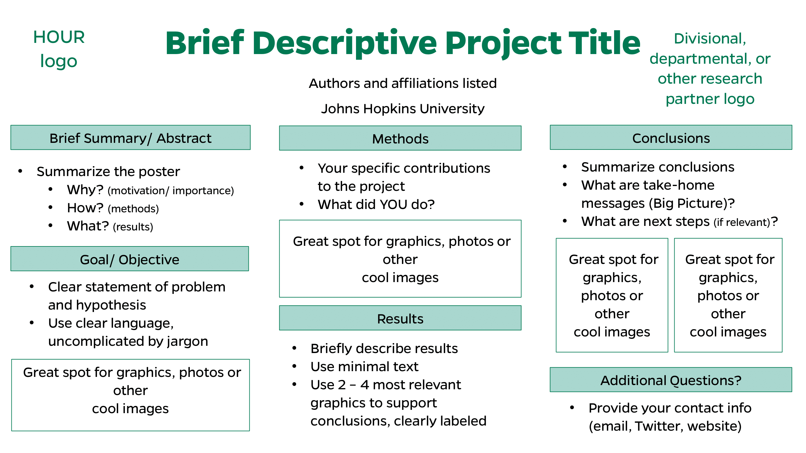
Creating a Dynamic Poster
The objective of the poster:
- Showcase your project or experience
- Demonstrate your abilities as a researcher
- Allow you to share information with the a community
- Develop your communication skills
- Build networks and contacts
- Help identify and establish collaborations
- A great source of feedback
Considerations while creating your poster:
- Who is your target audience?
- Event guidelines
- Quality over quantity – do not be too wordy!
- Create an interesting story
- The numbers game:
- 10 seconds for someone to decide to stay or go
- 10 minutes max to run through your poster/ project
- 20% text, 40% graphics, 40% ‘white’ space
- 4ft to 6ft – distance away from
Making your poster stand out:
- Interesting title
- Attractive pictures and figures
- Large, clean fonts
- (title: 85 pt., authors: 56 pt., headings: 36 pt., body text: 24 pt.)
- Balanced color choices
- (capture attention, highlight information, but do not distract)
- Visually appealing & readable
- Organized and flows logically
- Succinct and not overly wordy
- Presented clearly & with enthusiasm
- Provides everybody with something
Making the delivery work for you:
- Radiate enthusiasm and confidence
- Maintain eye contact
- Find out what your audience knows and target your story accordingly
- Tell a great story
- Use tone and inflection to emphasize key points
- Don’t just read your poster, use it as a reference
- PRACTICE! PRACTICE! PRACTICE!
Mistakes to avoid:
- Not following guidelines set by event organizers
- Not getting mentor approval (when necessary)
- Poster is too ‘busy’, not enough ‘white’ space
- Too much text, not enough graphics
- Not proof-reading before printing
- Not coordinating with printing/ shipping deadlines early enough
- Not proofing the finished poster after receipt
- Not practicing enough (knowing your project)
Website Footer Navigation

